ESco
2024
Publishing
2024
Publishing
ESco sought an execution-focused agency to bring their brand vision to life ahead of the publishing services company’s 40th year celebrations.
Out with the old…
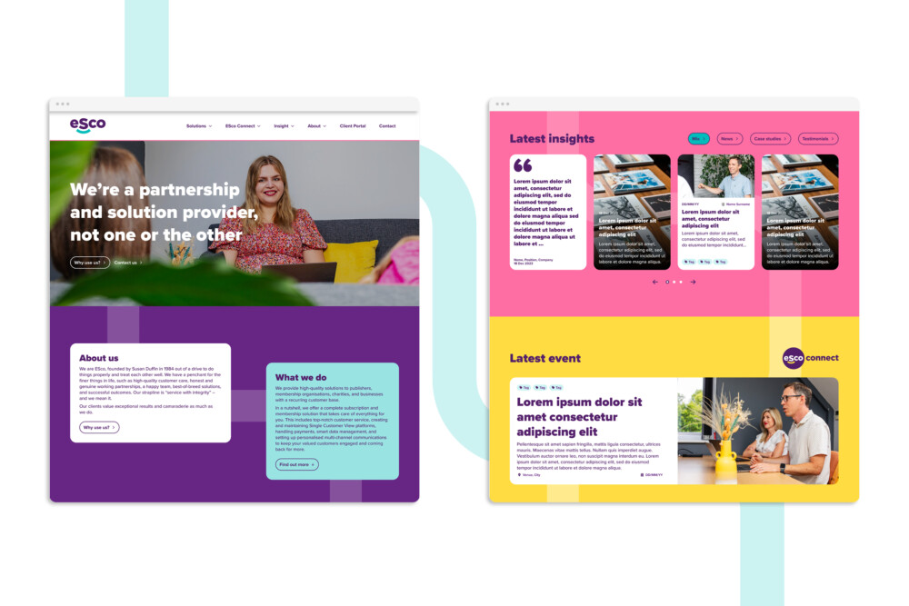
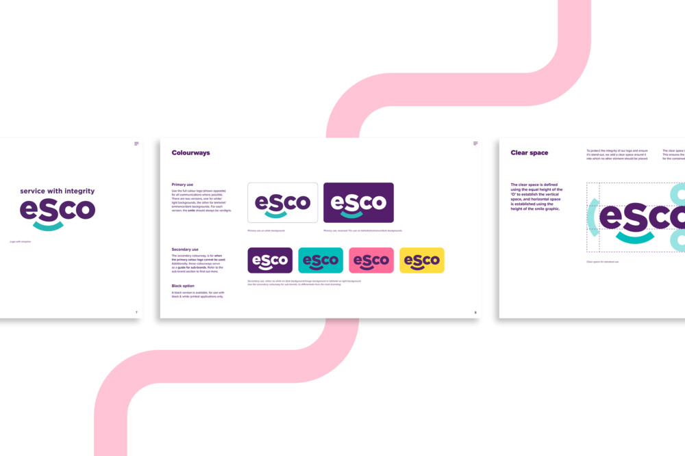
The goal was to create a brand that reflected the company’s legacy and ethos, and combined their heritage and reputation with the exciting future ahead of them. The brand identity revision included a fresh new logo, sub brand logos and a completely revamped website. Our first impression of the close-knit team helped inspire the brand journey. Following our mini brand workshop, we explored conceptual pathways which aimed to create a sense of belonging and connection.
… in with the new
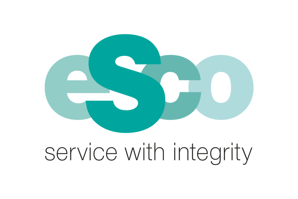
The curved accent of the logo denotes a positive emotional connection. This “smile” represents ESco’s relationship with its clients, end-users and team. We retained the emphasised “S” from the old logo to create continuity from the old logo to the new and to pay homage to the company’s founder, Susan Duffin.
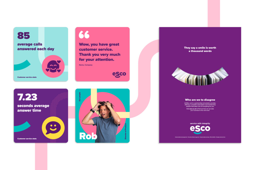
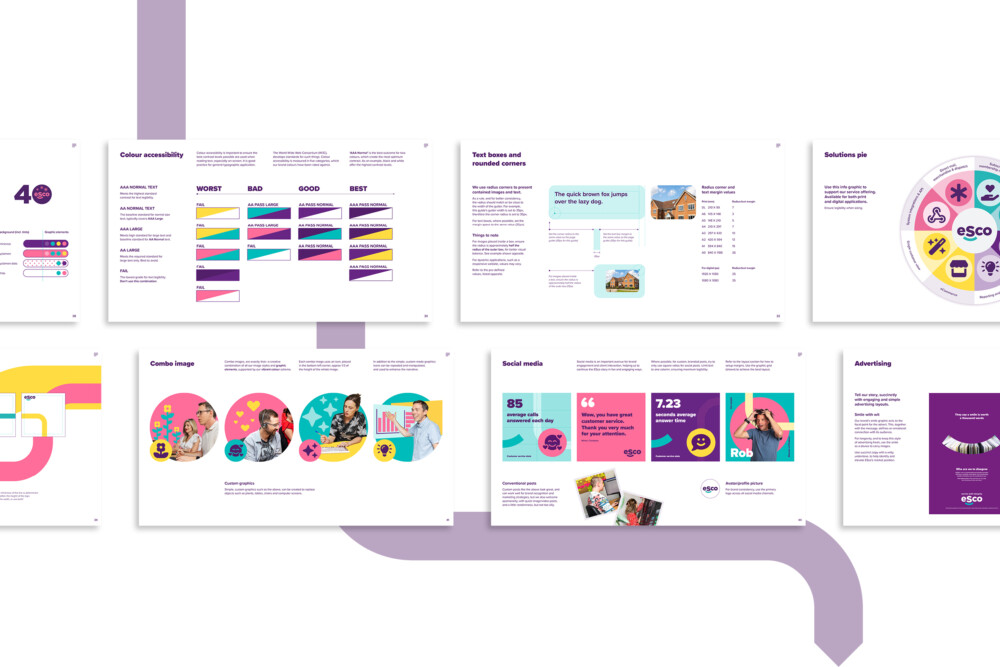
We provided a refreshed visual identity with a sleek, modern logo and updated colour palette. The ambitious brand design system uses geometric shapes derived from the logo’s smile. The shapes foster a sense of connection across ESco’s branded content. This, coupled with a vibrant colour palette and candid photography, helps to convey the authenticity of a brand that values its people and culture.

Celebrating 40 insightful and inspiring years
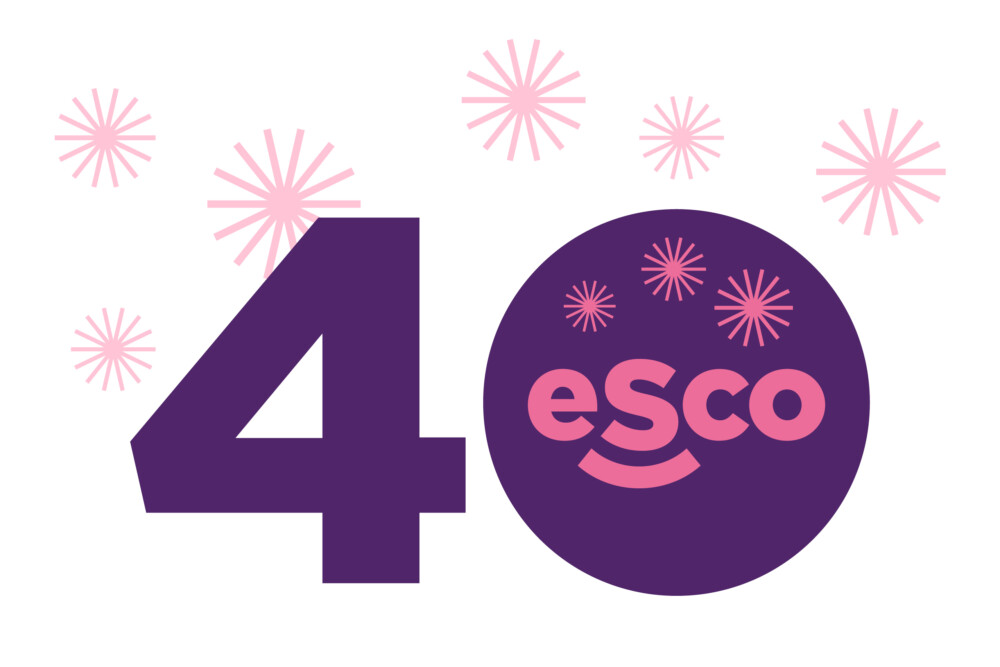
We designed and developed a high-performance WordPress website that prioritised user experience. The website serves as a hub for connecting publishers to insights and tools, as well as showcasing ESco’s service offering and achievements. It’s not every day that a business reaches 40 years of operating, and ESco had a packed calendar of events to celebrate this significant milestone. To help them celebrate in style, we also produced a limited edition 40th anniversary logo, featuring fireworks in the style of their geometric design system.
Our re-brand is not just a fresh coat of paint; it’s a reflection of our journey, our growth, and our vision for the future… We’ve worked hard to build a reputation for excellence, and our new logo and website are designed to enhance that reputation, showcasing the expertise, passion and integrity that we bring to every project.


