Depositmate
2019 - Present
Finance
2019 - Present
Finance
Branding & website development
Depositmate is the UK’s first dedicated deposit holding service that is aimed specifically towards private buyers and sellers of goods and services.
Whether you’re buying a new car, or selling an old bike, Depositmate works for all parties in every transaction, by protecting buyers from fraud and helping sellers to secure their sale.
With the ever-increasing range of private transactions taking place, DepositMate provides an independent deposit holding service, that offers a vital layer of security to all parties involved.
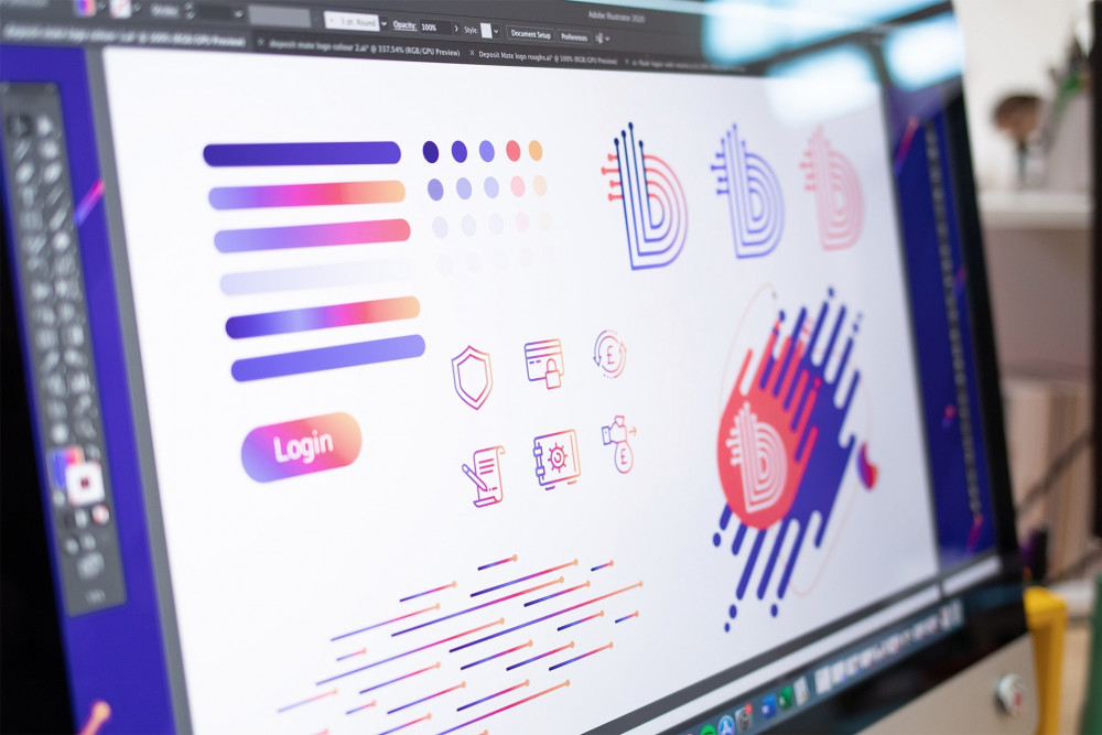
Developing a logo
When we were first approached by Depositmate, we were originally asked to enhance their logo design as they had previously been using a stock image. Naturally, as their company evolved, they needed something more unique to them.
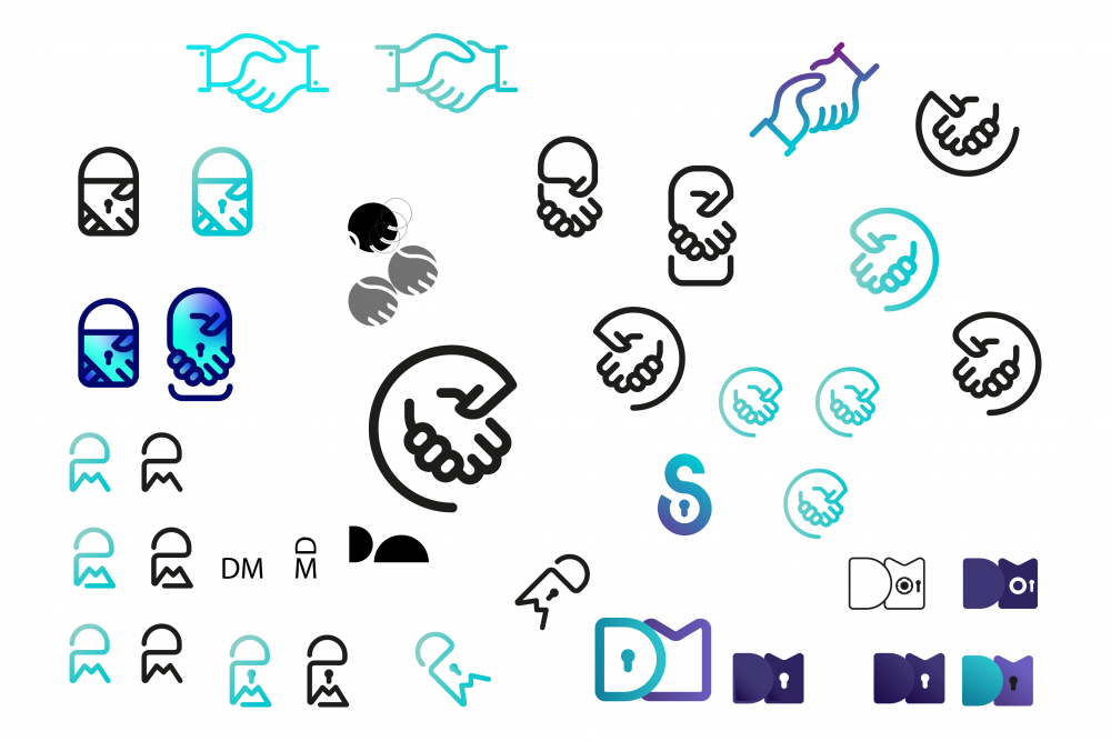
We initially started by concepting some designs, before focusing in on and honing certain designs.
Throughout the process, we explored themes that centred on trust, security, reliability, and efficiency, as these all encapsulate the brand ethos, while at the same time, helped to convey these to the customer.
Trust
Before settling on the final design, we shortlisted the following, with the client.
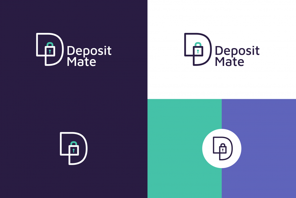
This logo uses the D as a symbol, which was designed to be used independently for various applications. As a result of using the D, we are able to reinforce the brand’s name, making it more distinctive.
The linear line style creates the feeling of a connected pathway that relates to the user journey. We enclosed a padlock within the D shape, to emphasise security as one of the main USPs.
The colours were chosen as they depict growth, friendliness, nobility, and loyalty, to create a feeling of being a trustworthy brand.
As with all of our designs, these were created with the potential of being animated for loading screens and screen transitions.
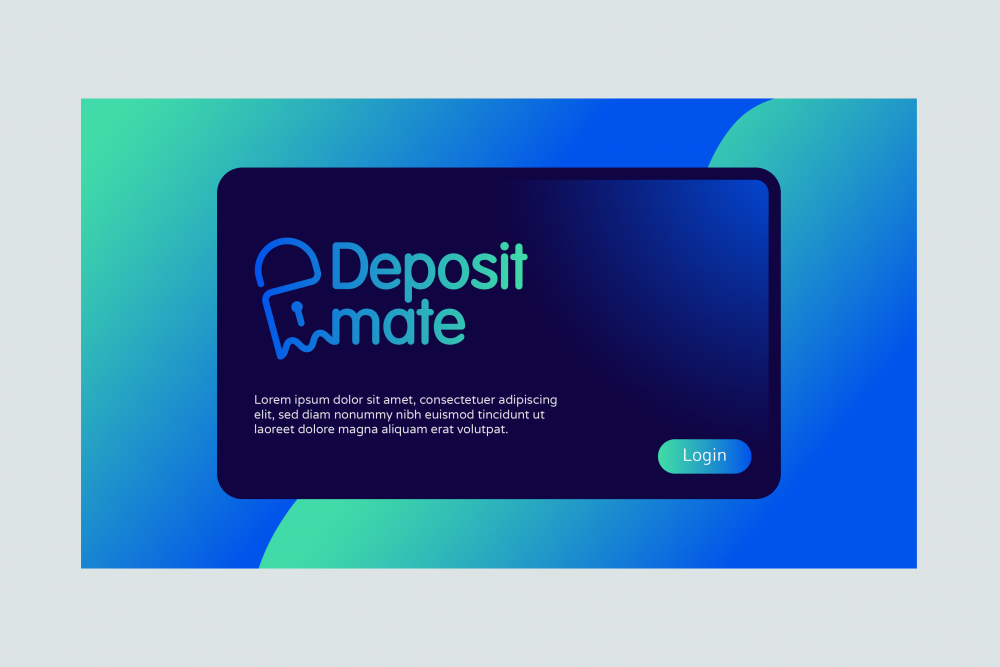
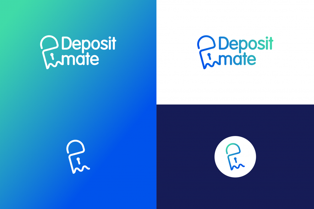
Security
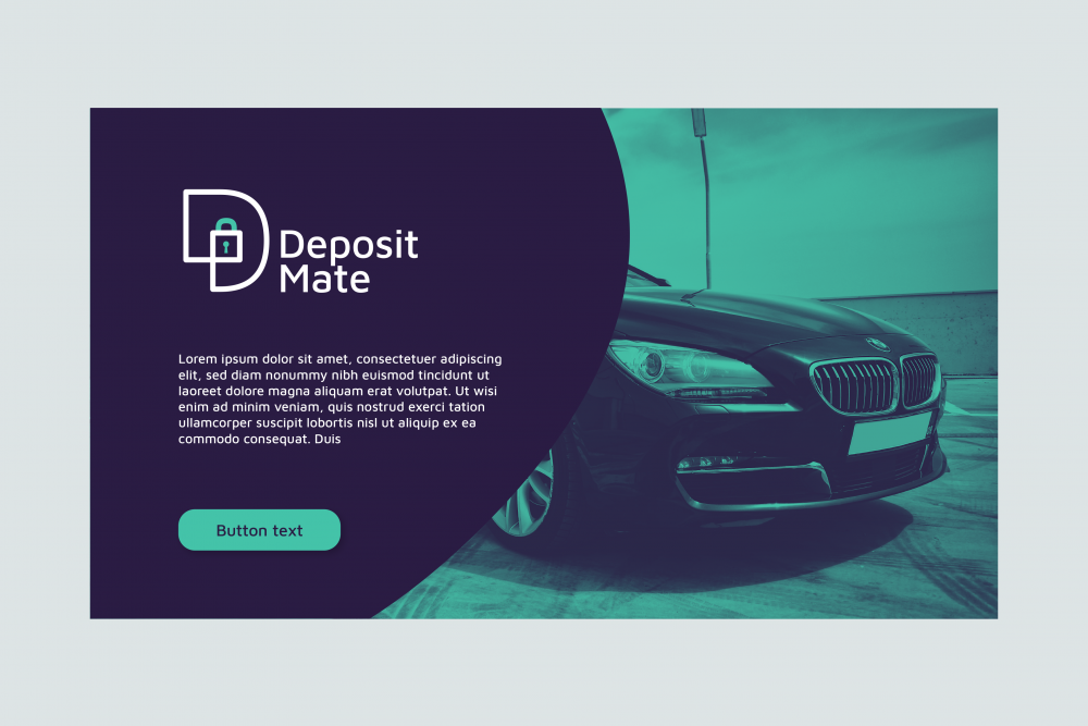
Again, a padlock symbol has been used here to emphasise security as one of the main USPs. Subtly hidden within the padlock symbol are the initials of the brand name.
The font used in the logotype, compliments the line width of the icon to offer an almost fluid connection when the logomark and logotype are combined.
The colours imply feelings of growth, intelligence, trust, and loyalty, to make the brand feel fresh and reliable.
Journey
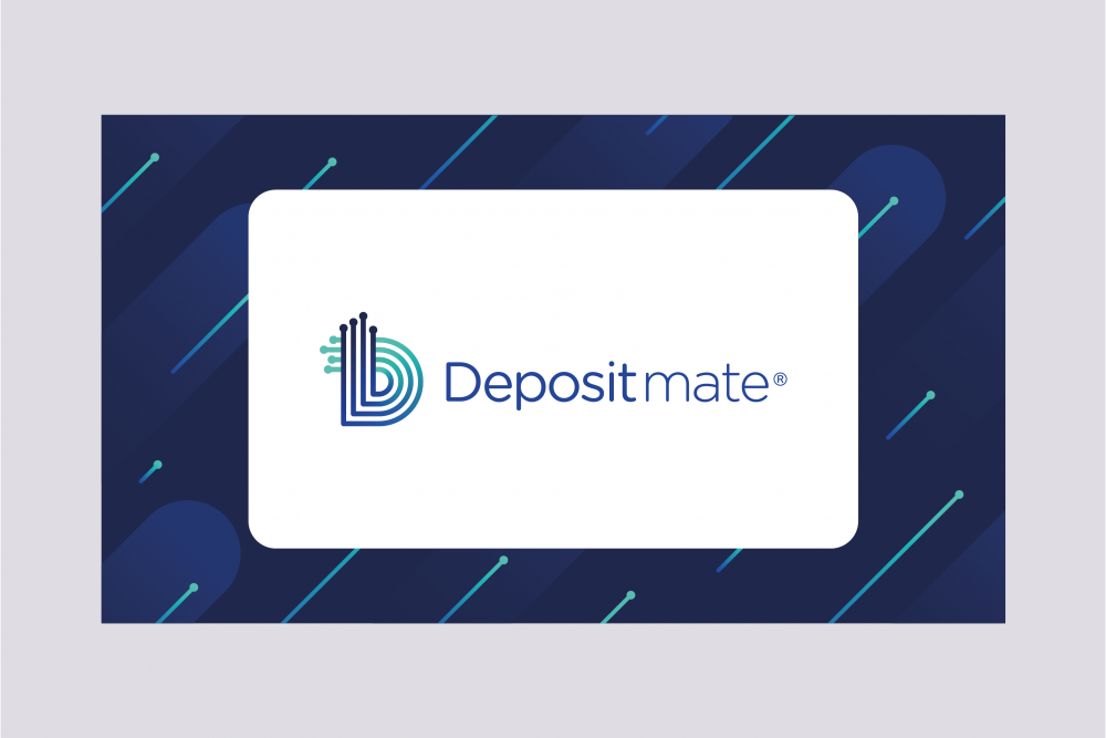
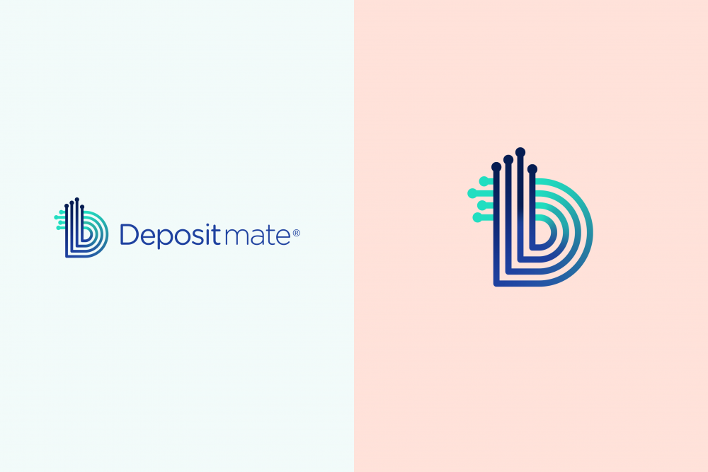
The approach for the final logo takes its influence largely from the user journey and the fact it is centred around a digital system. The lines imply start and endpoints and are based on the look of an interconnected digital grid.
The multiple lines also imply there can be many applications for the system and that the journey itself is fluid and dynamic; while the colours imply a sense of energy and ambition to make the brand feel extremely approachable.
As with the previous designs, this was developed with the potential for the icon to be animated for screen transitions.
Defining a safe customer journey
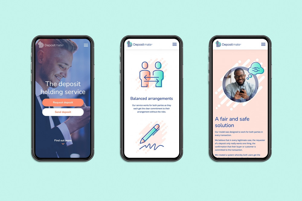
When developing Depositmate’s website, our brief lead to a more corporate feel, in order to emphasise security, trust, reliability, and efficiency.
With this in mind, we proposed a clean and elegant site that aimed to create a reassuring and easy way for potential users to fully understand the service and to feel at ease while using it.
Iconography
Throughout the site, we made use of customised and enhanced stock icons, in order to help users navigate the site and to illustrate core elements.
By utilising this hybrid method, we were able to achieve a bespoke look and feel, while keeping development time and costs focused.


Security to count on
From the outset, we knew that we had to develop a platform that focused on creating a safe and secure way for users to interact with the site, while at the same time create a trusted experience when using the service.
A fundamental element of Depositmate is security, which we knew was important to underpin with approval by the Financial Conduct Authority.
To become an approved business with the FCA, a strict process was entered into which ultimately steered much of the early development work. This was a really exciting process, as it resulted in multiple security measures being built into the platform, such as multi-factor authentication (MFA).
Ease of use
Following multiple discovery sessions, we knew that creating a seamless mobile experience would be essential, to allow for buyers and sellers to connect wherever they happen to be.
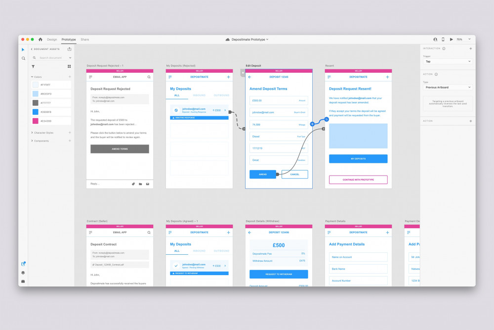
As Depositmate can be initiated by either the buyer or the seller, we needed to create a user path for both of these journeys, as well as the process for clearing any deposits.
Following us mapping these journeys, we could bring the site to life in a working prototype in XD. This allowed us to map out the entire website and focus on these journeys in more detail.


Integration
It was essential for specific functionality to be built into Depositmate, for security reasons and to allow for buyers and sellers to connect with each other in full confidence.
Further integrations were required for Depositmate to be able to interact and work with global banking groups and create a frictionless transfer of funds between accounts.
As a result, we integrated Twilio, TrueLayer and Yoti into Depositmate.
Summary
Since launching its website, Depositmate has exceeded all expectations and is currently planning on expanding its service to help more buyers and sellers connect with confidence.
To find out more, please take a look at our client page or contact us if you have a similar project we can help you with.

