People 1st International
Emphasising credibility and heritage.
People 1st are part of The Workforce Development Trust, an organisation we’ve worked with for many years. They offer consultancy, research, and training services to promote social and economic growth.


Creating a website that works hard
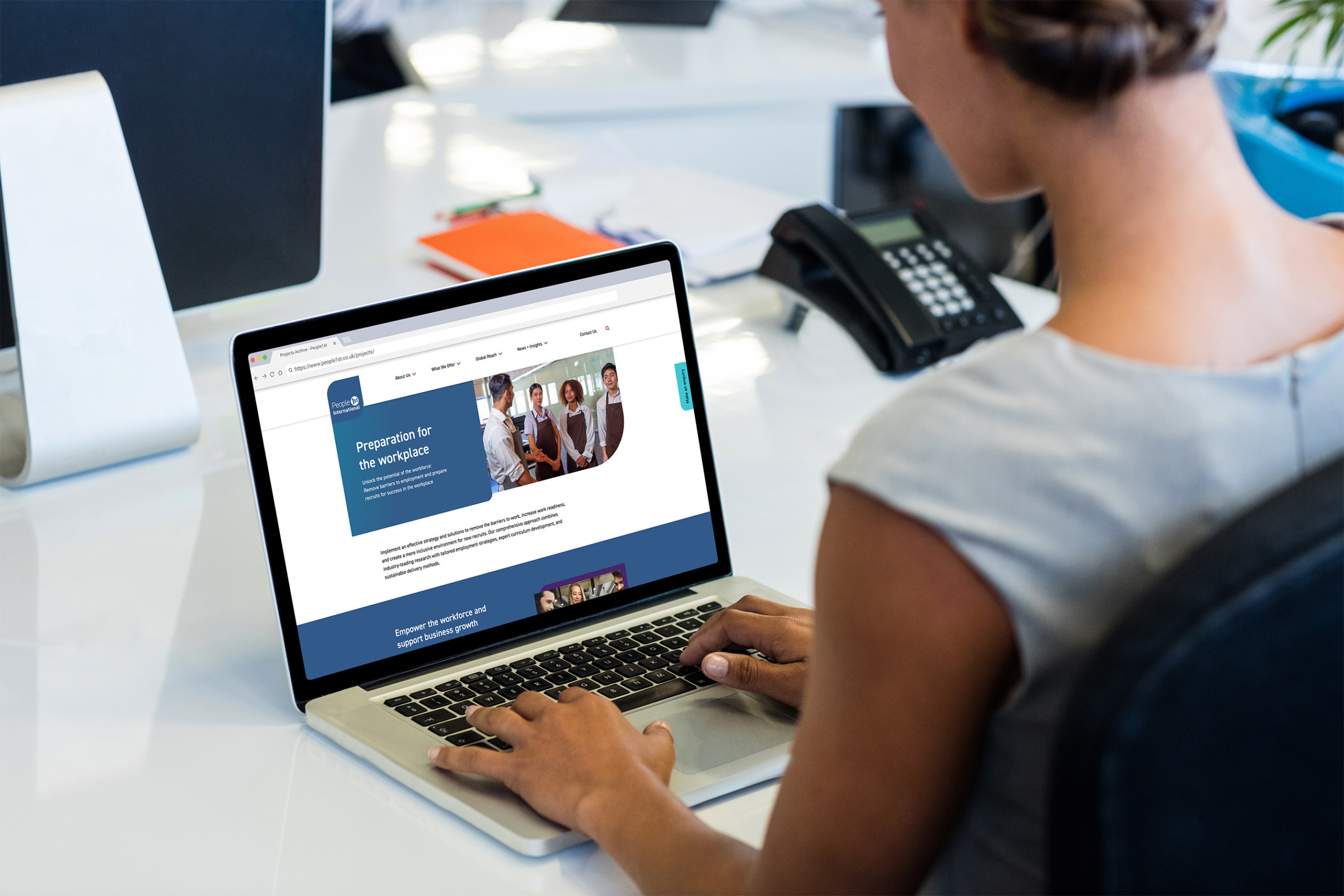
The not-for-profit organisation tasked us with redesigning and redeveloping its website to ensure it worked effectively as a critical marketing tool. This meant that the site needed to enable clients to recognise what People 1st do and demonstrate the organisation’s credibility and heritage.
Designing and developing bespoke and vital features
In order for the new website to function as a critical marketing tool, we introduced some features to help users engage with People 1st’s brand, placing particular emphasis on the organisation’s heritage and wide-reaching expertise.
People 1st’s global reach was an important factor to convey. We created an interactive map to display People 1st’s projects around the globe. When zoomed out, the pinned projects form hotspots that emphasise key locations where People 1st deliver their work.
The projects are a custom post type in WordPress which allows People 1st to update and add new projects easily and speedily. To find out more about how we prioritise the content editing experience with WordPress without compromising on the front end user experience, get in touch with one of our team today.
To highlight the organisation’s longstanding authority in skills development, it was important that the new website told “the story so far”. However, with over 50 years of information to share, it was vital we found a way to convey this information that could bring the user up to speed in a short period of time. We created a timeline that allowed the user to whizz through People 1st’s history from 1966 to the present day in a seamless and digestible manner.
With so many capabilities across a range of sectors, this website had a lot of information to convey. This meant that special attention needed to be paid to the navigation. We opted for a mega menu to allow users to get to their desired page within a couple of clicks. Additionally, short text excerpts and preview images that display on hover allow users to understand the content on each page before they click.
Implementing a refreshed look
Part of our brief was to modernise the design and implement People 1st’s new brand guidelines. Taking inspiration from the logo, we introduced square shapes throughout the website and used WD Trust’s rounded square as a motif throughout to bring the user interface inline with other sites in the WD Trust portfolio.
In addition to the static elements on the page, we introduced hover states and subtle animations to elevate the user experience and further emphasise People 1st’s slick and modern brand identity.


“I wanted to say a big thank you for all of your support throughout the project – your project management and communication has been spot on, making it a really enjoyable process. Thank you to the whole team for your hard work – the website looks really great”
Jo Parker, Head of Communications & Digital Media


