Design fundamentals

Design fundamentals are a collection of essential elements, used as the basis to create engaging designs and user experiences. Some are obvious, others less so, and there are many iterations of design fundamentals out there; this is our take.
Every designer should know, form follows function. This applies to practically any designer in any industry, and helps to reiterate that design exists for a purpose.
Although creativity can happen by accident, nothing a designer does is by chance. It takes a designer to strategically choose what elements to use — any of which impact how design is perceived and interacted with.
Here, our design fundamentals cover all principles of visual design, such as branding, digital products, printed brochures, and advertising to name just a few.
Lines
Everybody knows what a line is right? Aside from being the shortest distance between two points; have you ever considered how powerful the humble line can be?
In the world of design and image making, lines are used everywhere. They can convey a sense of rhythm and direction, they can make us feel comfortable, alert, or confused.
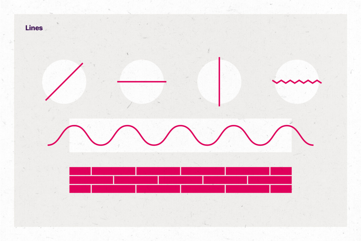
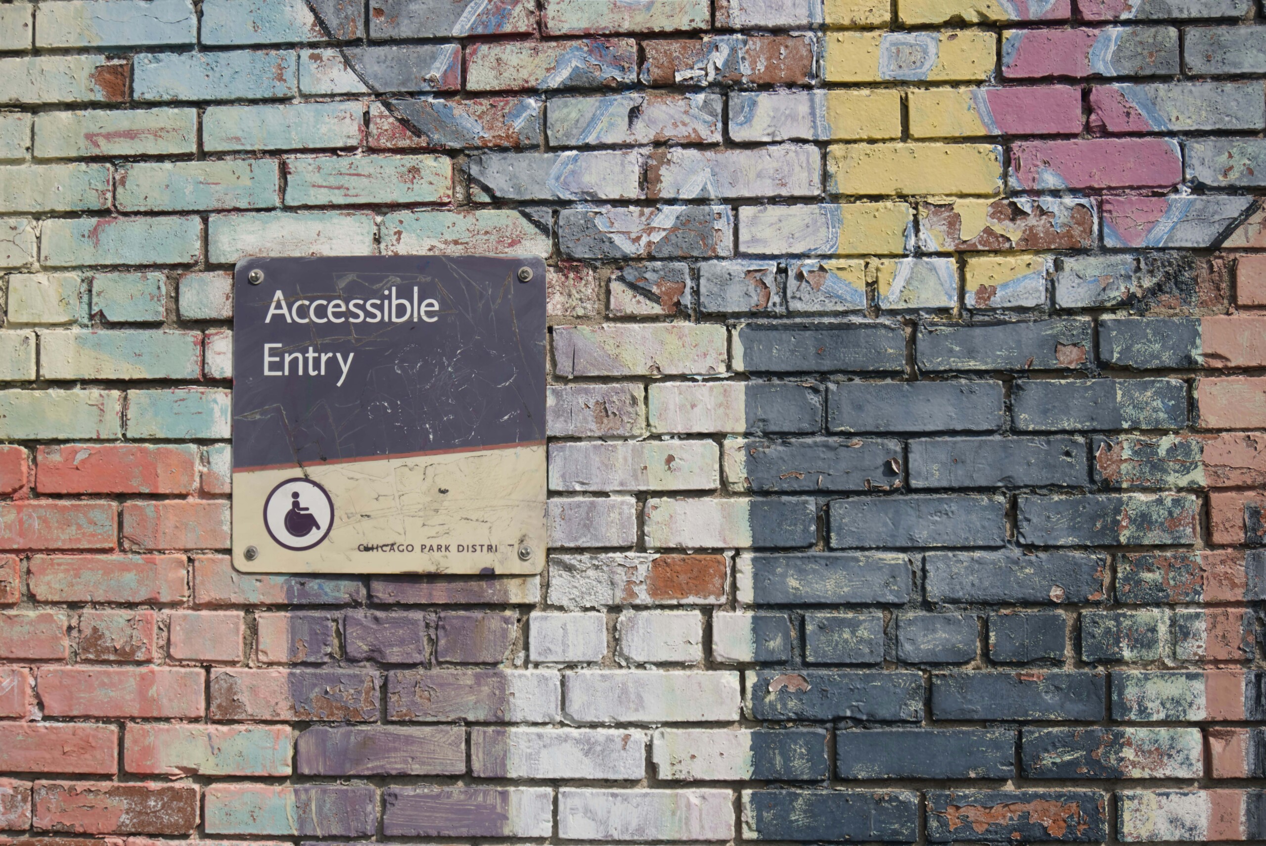
For example, diagonal lines are dynamic, offering a certain type of energy. Whereas, horizontal lines are perceived as relaxed and tranquil. Vertical lines, on the other hand, give a sense of importance, direction, and even danger! Lines can be found in nature, or man-made materials, and they can of course be created in various ways using different mediums, but did you know that there are two types of lines? First, an actual line is created by connecting two points — this is the standard line we’re all familiar with. Second, there is an implied line, which is made by connecting shapes, such as a line of bricks for example.
Shapes
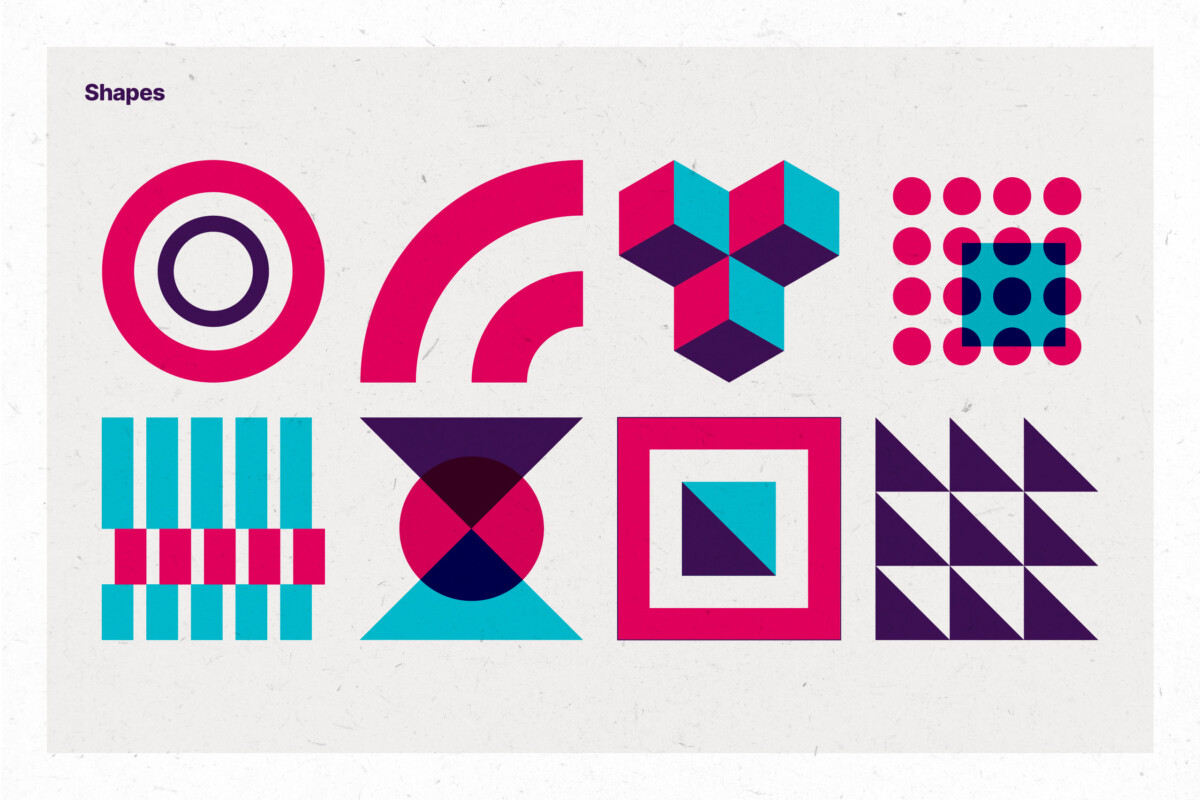
Our second design fundamental is the shape. Shapes are constructed by lines and colour, to form 2D and 3D forms. They can be geometric, abstract, and organic. Shapes can also be repeated and manipulated to create beautiful patterns, adding depth and texture to an aesthetic.
Shapes are used everywhere in design. They can be used to contain or to divide, combine or separate. They can help us see things differently, to emphasise or to take away, and even play with our emotions. Shapes help define how we consume information, and perceive art and design in all its manifestations.
Colour
Colour is another fundamental, albeit, obvious design element. There would be no colour without light, in fact colour is light. We all see colour differently, sometimes the differences can be subtle, sometimes drastic. Like shapes, the world of colour can be very basic or extremely complex.
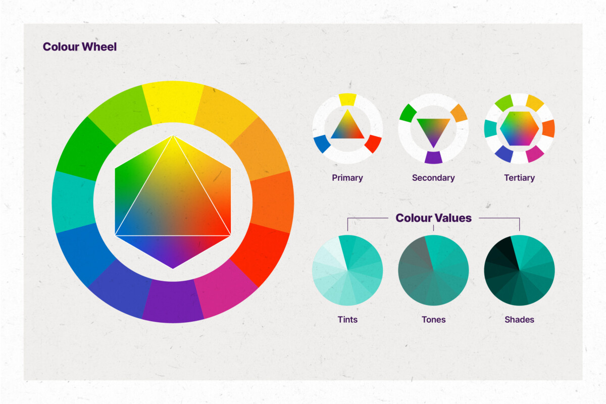
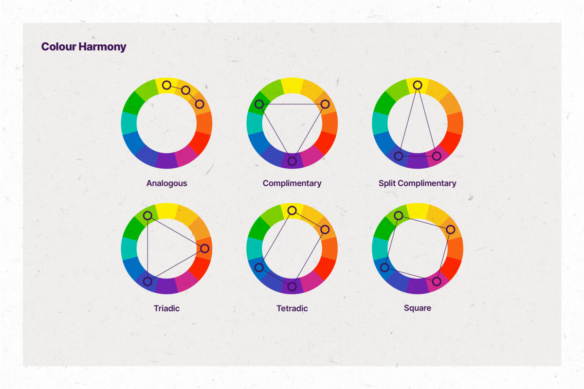
Colour Theory offers practical guidance for applying colour for visual effect, and dates back to antiquity, when different colours were made by mixing other colours. Colour terminology in perpetuated by the Colour Wheel, which uses geometry to separate primary and secondary colours into categories of colour harmonies (see examples below).
Using a tool such as a colour wheel to generate a colour palette; it is important to know the properties of colour variations:
Hues
Hues refer to the basic family of colours, and corresponds to its position on the colour spectrum. From red to violet, hues are variations of a base colour found on the colour wheel, and it is what people think of when using the term ‘colour’.
Values
A colour value can be adjusted to make it lighter or darker. Shades appear more dramatic and richer, by applying black values to a base colour to enhance its darkness. Tints do the opposite of shades, by applying values of white to make the colour lighter and less intense. Tones, similar to shades and tints — tones apply grey to a base colour by increasing its lightness, tones look more sophisticated and complex than base colours.
Saturation
The saturation of a colour is an attribute that refers to its level of richness, intensity, purity, or greyness. Any single hue, such as orange for example, can have many degrees of high or low saturation. Accent colours, tend to have a high saturation.
Temperature
Temperature are perceived as warm and cool colours, with greens and blues being cool, and reds and yellows being warm.
Colour can be used to help evoke a mood, or to visually enhance something for a purpose. Colour often relies on our subconscious to provoke an emotional reaction, perpetrated further by cultural influences. For example, blue can imply trust and loyalty, and red can mean both danger and love — in far-eastern cultures, red is considered to be lucky. How many corporate logos can you think of which are blue?
Colour psychology influences how society perceives and interacts with colour, and it can either make or break a piece of design.
Typography
Typography is the art of arranging text to make written language readable and appealing at the same time. Every piece of text-based design needs typographic treatment. An essential design element for any brand; typography is powerful, especially when it is combined with the right tone and writing style, to tell a story, deliver a brand message, convey a mood, to instruct or direct.
The look and feel of type can affect how we perceive text, and has the power to engage when it is done well. Accessibility standards should always be considered when using typography. Font choice, size, layout, and hierarchy are all important components of typography, and are typically orchestrated by a professional.
Fonts and typefaces
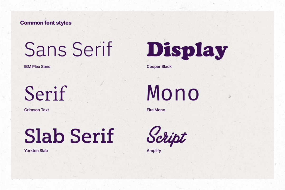
A typeface is a design of lettering that includes variations in style, such as size, weight, and spacing. Each of these variations is called a font. For example, Helvetica is a typeface, Helvetica Bold is a font. Choosing the right font can help make or break a design.
Layout
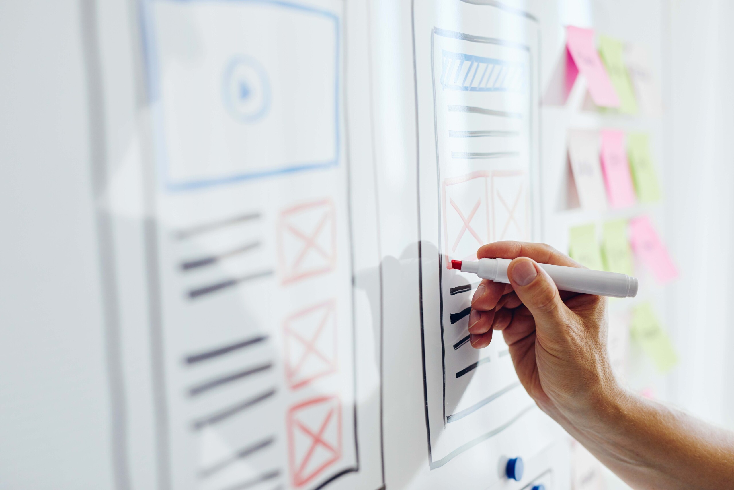
In this case, a layout is the way text and images are set out on a page, whether it is for print or online. A good layout is well-balanced, pleasing to the eye, and easy to digest. A bad layout, can result in chaos and confusion.
Hierarchy
Hierarchy determines the structure of information on any given layout. The main ingredients for typographic hierarchy are font size and position. Done right, the hierarchy of a layout can guide our eyes to absorb content in the correct order to convey an idea or story with clarity. Done wrong, however, and the results can be confusing and much less-engaging.
Space
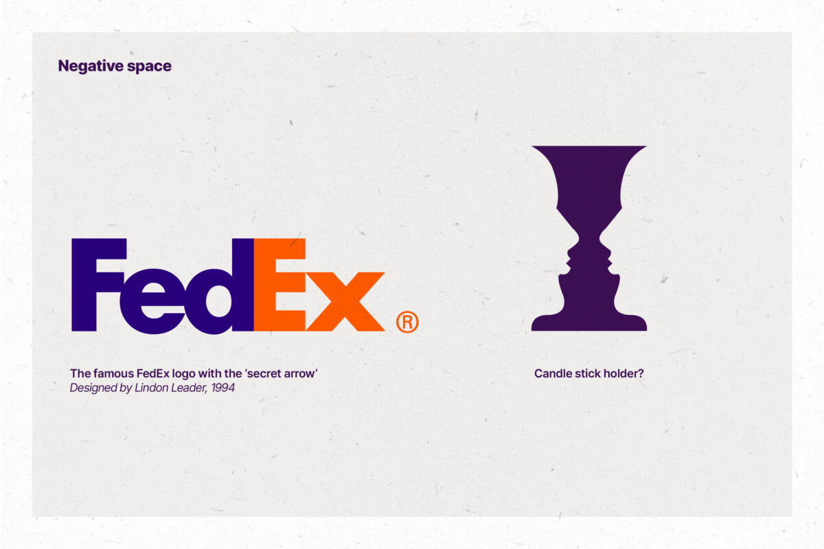
Space can be negative or positive, and describes an area that is open, behind, above, below or around and object. Positive space is how we naturally see things, and refers to an area that is occupied by something visible, such as a shape filled with colour. Negative space, or “white space” as it is often referred, represents the area that is arguably empty, such as a background.
Negative space is essential to the success of your design. Its purpose is to help content breathe, and not overwhelm the viewer. Without space, our focus of content would be difficult to grasp. Done correctly, space has the ability to enhance readability, simplify a design, and add a sense of luxury.
Contrast
Being in a state of contrast, means it is different to something else. In design, this can refer to the levels of opposing colours, and the difference between light and dark. Contrast applies emphasis, helping to distinguish elements from others. Logos and icons, for example, rely heavily on good contrast for legibility.
Contrast levels are fundamental to design, especially for colour accessibility standards, to ensure equal access to content. To find out more about colour accessibility, visit w3.org and webaim.org. There are some great tools and resources out there, which you can use to check the contrast and accessibility of your designs. Adobe have their own contrast checker, and we sometimes use this tool to check levels on live websites.
Balance
In design, two or more opposing forces, require balance to create harmony and steadiness within a composition. To achieve this, elements are arranged either symmetrically, asymmetrically, or radially to create the impression of equality in scale or importance.
Design elements such as lines, shapes, and text can appear off-balance, resulting in a disruptive or uncomfortable viewing experience. We use balance to aid the layout and hierarchy of a page, to help direct the viewer’s eye, so that they can digest information efficiently and comfortably. Viewers are consuming information at an ever-accelerating rate, and so it is more crucial than ever that content is displayed effectively.
To support the desire to create equality through visual information, we rely on our design eye, intuition, and various tools. Layout grids, guidelines and tried and tested methods like the golden ratio and the rule of thirds help us achieve balance in design.
Pattern/texture
Both patterns and textures serve to create visually appealing elements within a given space.
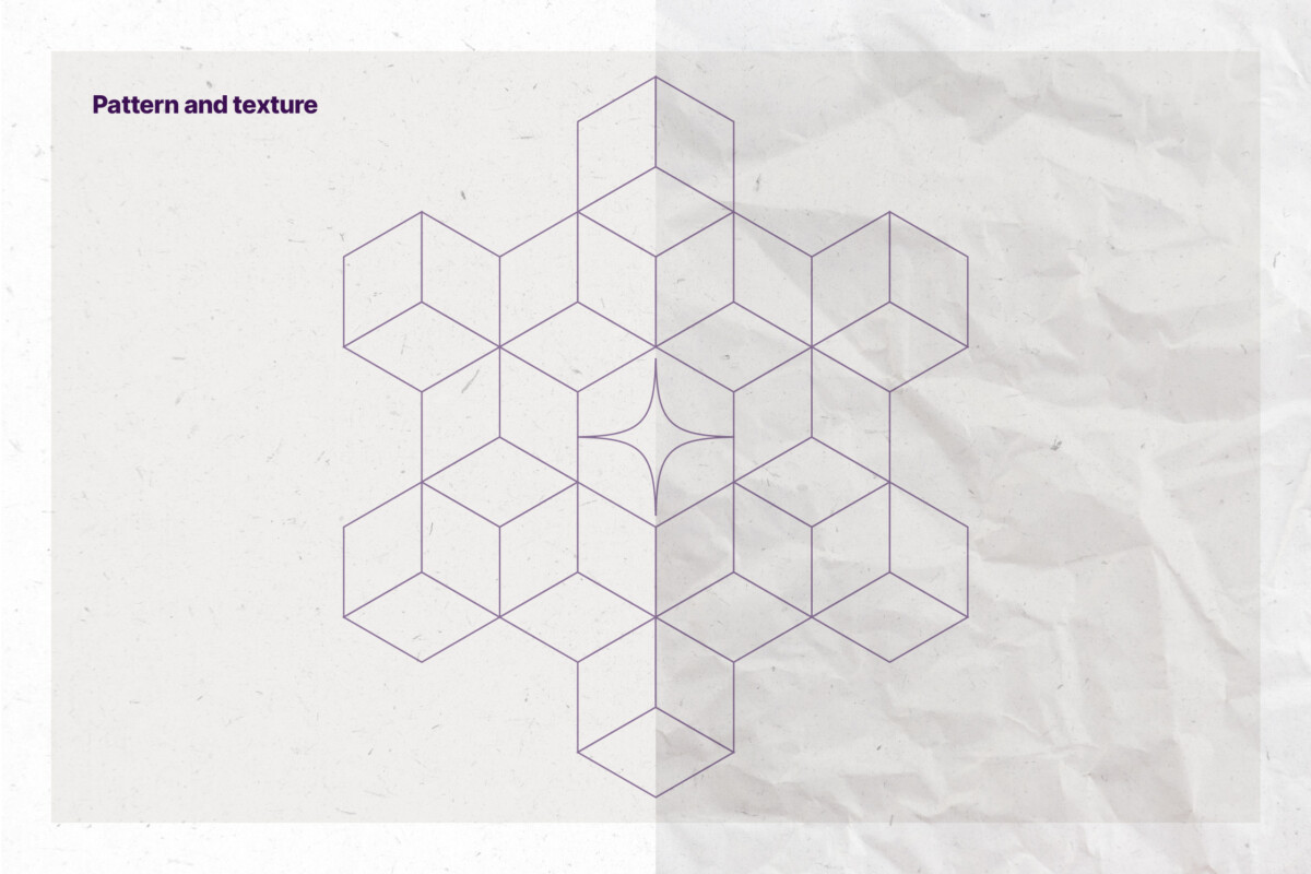
Patterns can be made up of a combination of shapes, lines, and colour. Patterns are typically repetitive, delivering rhythm and scale to offer vibrant, rewarding aesthetics.
Textures on the other hand can be applied in a similar vein to patterns, but serve as an alternative aesthetic by using real-world materials. Natural or man-made, textures can appear tactile, adding depth to your design. Whether it is concrete, wood, or paper; a texture can accompany the story of a brand or idea.
Image
Images are an essential part of graphic design. From beautiful photographic landscapes, to manipulated composites; we are naturally drawn to them, making them a powerful asset for visual storytelling. Combined with text, the relationship between image and messaging can challenge our emotions and influence our desires.
In an ideal scenario, designers will work with professional photographers and art directors to help create images for a specific purpose. If this isn’t an option, there are many stock image libraries available, offering different levels of quality and licensing options to suit any budget. Getty Images is probably the most popular image resource on the planet, owning iStock and more recently acquired Unsplash.
Being able to identify what makes a good image work, and how it should be applied, is a skill in itself.
Unity
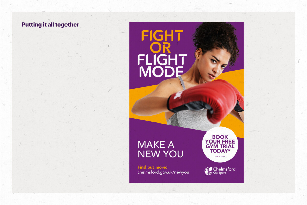
Unity is what happens when you bring all of these elements together to create a visually compelling composition. These fundamentals of design go hand in hand with good storytelling to engage its audience.
Most brands use a design system to unify these design elements, ensuring they are visually distinctive and applied consistently.
If you have any questions for the Fever team, either about the design services we offer, or anything else that you’ve been wondering, please don’t hesitate to contact us.
By Mark, Senior Designer
